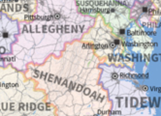
One of my favorite geographic visualizations is by Neil Freeman, where he took a map of the U.S. and kept the physical boundaries and cities, but morphed state boundaries (and renamed them as well) to create a map with 50 states, each with equal population. It’s a pretty amazing mixture of real maps, real data, and imagination.
-
Subscribe
Subscribed
Already have a WordPress.com account? Log in now.
