Everyone’s interested in the global climate these days, so I’ve been looking at the GISTEMP temperature series, from the GISS (NASA’s Goddard Institute for Space Studies). I was recently analyzing the data and it turned into an interesting data forensics operation that I hope will inspire you to dig a little deeper into your data.
Let’s start with the data. GISS has a huge selection of data for the discerning data connoisseur, so which to choose? The global average seems too coarse — the northern and southern hemispheres are out of phase and dominated by different geography. On the other hand, the gridded data is huge and requires all kinds of spatially-saavy processing to be useful. (We may go there in a future post, but not today.) So let’s start with the two hemisphere monthly average datasets, which I’ll refer to as GISTEMP NH and GISTEMP SH.
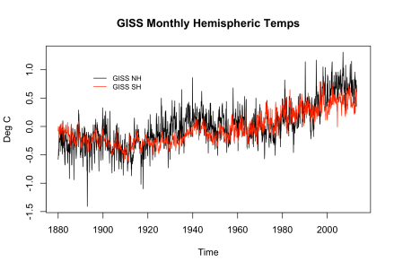
To be specific, these time series are GISTEMP LOTI (Land Ocean Temperature Index) which means that they cover both land and sea. GISS has land-only data and combines this with NOAA’s sea-only data from ERSST (Extended Reconstructed Sea Surface Temperature). I’d also point out that all of the temperature data I’ll use is measured as an anomaly from the average temperature over the years 1951-1980, which was approximately 14 degrees Celsius (approximately 57 degrees Farenheit). So let’s plot the GISTEMP LOTI NH and SH data and see what we have.
We can see that the NH and SH are not just out of phase, but actually have different trends. Much of this may be due to the fact that the NH is about 40% land, while the SH is only about 20% land. Some of it might have to do with the majority of the world’s population living in the NH (I’ve read it’s something like 90%), though most pollutants are fairly well-mixed in the atmosphere. Also, with more land in the NH, there will be more change in land usage, which has an important effect on climate.
Nothing really stands out in a graph of the mean temperatures (temperature anomalies, remember), so let’s do some data forensics and look at two measures we can derive from them. The first one is volatility, which is how much the temperature changes from month to month, also known as the first difference of the monthly means. The second is a rescaled range analysis, which looks at how the range of the temperatures changes over time.
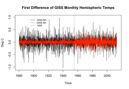
In terms of the volatility, we would expect the NH to be more volatile than the SH because the ocean is a moderating influence on temperatures. (That is, it holds more energy.) So let’s look at an overlaid graph of the first differences:
And our curiosity has been rewarded! We’ve found something unexpected: up until about 1955, the SH has about half the volatility of the NH, then the volatility jumps to a level comparable to the NH. We live on a big planet with lots of climate momentum, so large jumps like this are exceptional. Two questions come immediately to mind: 1) is this jump due to land temps, sea temps, recording, processing, or something else, and 2) is the volatility initially low then reasonable, is it initially reasonable then high, or are both values reasonable?
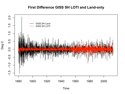
The first thing we can do is to download the SH land-only series from GISS. (It’s linked to from the same web page as the GISTEMP LOTI data.) When we graph the first differences of SH land-only and SH LOTI,

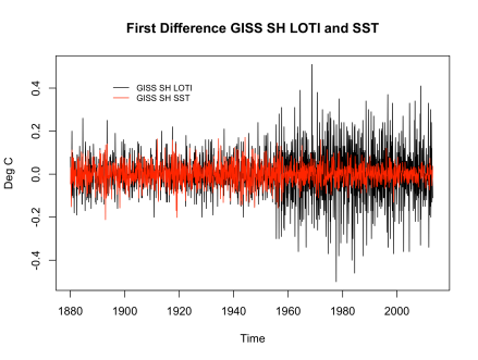
we see that the higher LOTI volatility is similar to the land-only volatility. So perhaps it’s a matter of the pre-1955 sea-only temperature pulling the volatility way down. It takes a bit more research to find the sea-only ERSST (Extended Reconstructed Sea Surface Temperatures) data, but once we have it, we don’t see what we might’ve expected:
There’s no jump in the SST’s. Okay, so there’s no jump in the SST’s and there’s also no jump in the land-only data, yet there’s a jump in the combination of the two. There must be something odd going on in the processing of the data, which could be an enormous task for us non-climate-scientists to figure out. So let’s take a step back and see if we can find anything climate-related that might’ve happened in the SH in 1955.
I didn’t find anything in an initial google search. But a query on Judith Curry’s climate website yielded a clue from Captain Dallas who mentioned that Antarctic temperatures may have come online during that period. Steven Mosher linked to a couple of papers from the Berkeley Earth Surface Temperatures (BEST) project, and one of them mentions a jump in the number of weather stations in 1955: “The step- change in coverage circa 1955 corresponds to the initiation of weather monitoring efforts in Antarctica.” So it seems that the jump happened because of the addition of weather from Antarctica.
This explains the “what?” but not the “why?”. We looked at the land-only data, and there’s no jump in 1955 from the Antarctic data being added. Are there actually three datasets instead of just two? Is the Antarctic not “land”? At this point, I had to get more subject-matter expertise, and once again Captain Dallas had a gem: GISS interpolates temperatures over much longer distances than other climate products (up to 1200 km), and Antarctica is far enough from most land to not cause any interpolation issues in the land-only dataset, but once land and sea are combined, long-distance interpolation occurs.
So the jump is due to the way that GISS processes the data, in particular to its interpolation methods, which differ from other temperature datasets out there.
OK, enough work for one day, let’s take up the rescaled range analysis in the next posting.


