Last time, we modeled the Association’s electricity expenditure using Bayesian Analysis. Besides the fact that MCMC and Bayesian are sexy and resume-worthy, what have we gained by using Stan? MCMC runs more slowly than alternatives, so it had better be superior in other ways, and in this posting, we’ll look at an example of how. I’d recommend pulling the previous posting up in another browser window or tab, and position the “Inference for Stan model” table so that you can quickly consult it in the following discussion.
If you look closely at the numbers, you may notice that the high season (warmer-high, ratetemp 3, beta[3]) appears to have a lower slope than the mid season (warmer-low, ratetemp 2, beta[2]), as was the case in an earlier model. This seems backwards: the high season should cost more per additional kWh, and thus should have a higher slope. This raises two questions: 1) is the apparent slope difference real, and 2) if it is real, is there some real-world basis for this counter-intuitive result?
As for the first question, we can immediately reap the benefit of having chosen to do a Bayesian analysis: we have thousands of samples from the posteriors of the two slopes, so we can easily look at the density of the difference of the two slopes to see what it might tell us. In R, continuing to use rstan we would graph this:
b2b3diff <- c(extract (stan.model.elect.re5B, pars="beta[2]", permuted=T)$`beta[2]` -
              extract (stan.model.elect.re5B, pars="beta[3]", permuted=T)$`beta[3]`)

plot (density (b2b3diff), xlim=c(-5, 7), main="Difference of beta2 - beta3")
abline (v=c(-1, 1), lty=3)

hpdi <- HPDinterval (mcmc (b2b3diff))
abline (v=hpdi[1,])
Which results in the graph:
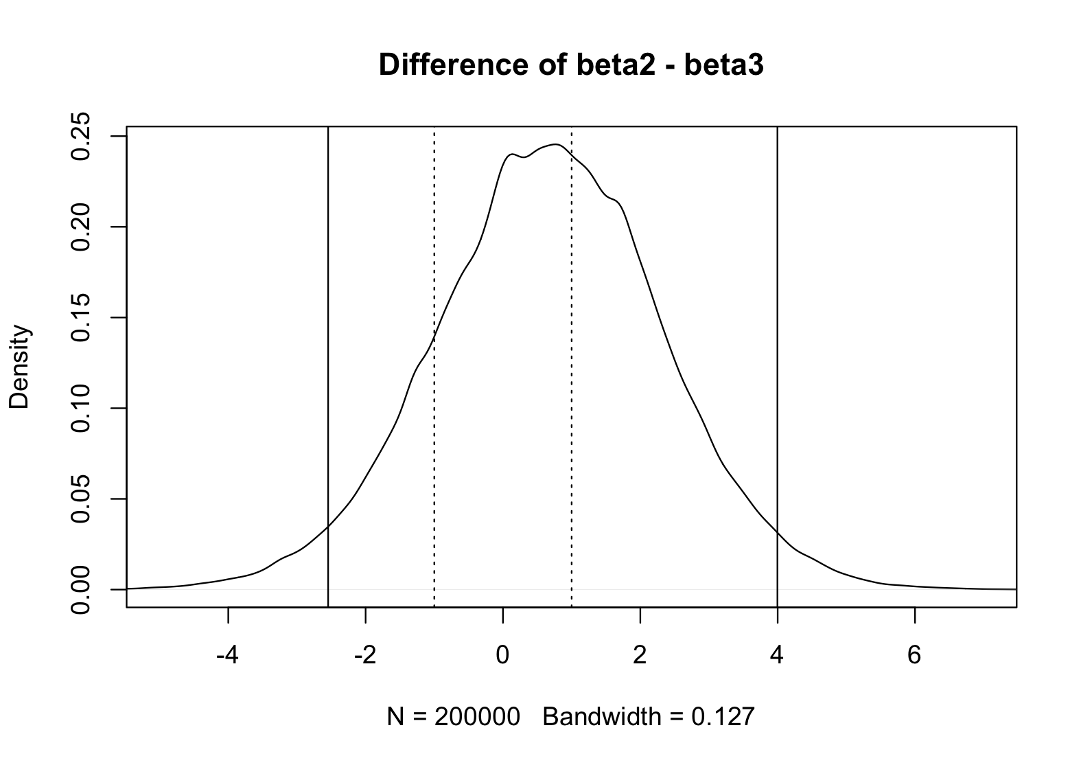
Where the dashed lines represent a ROPE (Region of Practical Equivalence) for zero, in this case meaning that we’ll consider any difference +/- 1 as being equivalent to zero for decision purposes, and the solid lines represent the 95% HDI (Highest-Density Interval). If the 95% HDI were contained entirely in the ROPE, we could confidently state that the difference was zero (i.e. beta[2] = beta[3]). If the 95% HDI fell entirely above the ROPE, we could confidently state that beta[2] > beta[3], and similarly if the 95% fell entirely below the rope, we could say that beta[2] < beta[3]. None of these cases is true, so we can only say that the data is variable enough that we cannot be confident of the relationship between beta[2] and beta[3].
Note that the Bayesian approach is intuitive: we look at the posterior distribution of beta[2] – beta[3], just as we look at any other posterior to make decisions. Note also that the Bayesian approach could have either rejected or accept a hypothesis, unlike frequentist methods that could only reject or fail to reject. (Bonus: we don’t have to get bent out of shape trying to decide on The Null Hypothesis, we simply choose a hypothesis.) However, in this particular case, we ended up with the third option: we can neither accept nor reject the idea that beta[2] = beta[3], because our data is just not good enough to make the call. The graph gives us a hint that it might be slightly more likely that beta[2] > beta[3], but unless we get more data, we’re stuck. (We could, of course, simply go with the point estimates — the mean of the posterior values — in which case beta[2] > beta[3], but we’re statistically sophisticated enough that we know it’s all about intervals.)
So the data, within this model, doesn’t speak clearly enough to be certain of any slope difference. Which means we don’t really have to answer the second question, since we can’t tell if the difference is real. Still, there is a possible explanation: there is not a single amount of money we pay for a single kWh, it’s a banded scale with each band costing less than the previous — a discount for buying in bulk, as it were. So the first kWh of electricity we use costs more than the hundred-thousandth kWh.
Obviously, a hundred thousand kWh cumulatively costs more than 1 kWh, but the marginal rate for one more kWh is lower. To complicate matters, the breakpoints between bands is determined by demand for the month. Which suggests that there could well be a jump when the higher summer rate kicks in, but that the slope might be lower since using an additional kWh during an already high-usage period might not be as expensive as using one during a lower-usage period, depending on the ratio of demand to usage.
