When I first heard of SSA (Singular Spectrum Analysis) and the EMD (Empirical Mode Decomposition) I though surely I’ve found a couple of magical methods for decomposing a time series into component parts (trend, various seasonalities, various cycles, noise). And joy of joys, it turns out that each of these methods is implemented in R packages: Rssa and EMD.
In this posting, I’m going to document some of my explorations of the two methods, to hopefully paint a more realistic picture of what the packages and the methods can actually do. (At least in the hands of a non-expert such as myself.)

EMD
EMD (Empirical Mode Decomposition) is, as the name states, empirical. It makes intuitive sense and it works well, but there isn’t as yet any strong theoretical foundation for it. EMD works by finding intrinsic mode functions (IMFs), which are oscillatory curves that have (almost) the same number of zero crossings as extrema, and where the average maxima and minima cancel to zero. In my mind, they’re oscillating curves that swing back and forth across the X axis, spending an equal amount of time above and below the axis, but not having any fixed frequency or symmetry.
EMD is an iterative process, which pulls out IMFs starting with higher frequencies and leaving behind a low-passed time series for the next iteration, finally ending when the remaining time series cannot contain any more IMFs — this remainder being the trend. Each step of the iteration begins with fitting curves to the maxima and minima of the remaining time series, creating an envelope. The envelope is then averaged, resulting in a proto-IMF which is iteratively refined in a “sifting” process. There are a choice of stopping criteria for the overall iterations and for the sifting iterations. Since the IMF’s are locally adaptive, EMD has no problems with with non-stationary and non-linear time series.
The magic of IMFs is that, being adaptive they tend to be interpretable, unlike non-adaptive bases which you might get from a Fourier or wavelet analysis. At least that’s the claim. The fly in the ointment is mode mixing: when one IMF contains signals of very different scales, or one signal is found in two different IMFs. The best solution to mode mixing is the EEMD (Ensemble EMD), which calculates an ensemble of results by repeatedly adding small but significant white noise to the original signal and then processing each noise-augmented signal via EMD. The results are then averaged (and ideally subjected to one last sifting process, since the average of IMFs is not guaranteed to be an IMF). In my mind, this works because the white noise cancels out in the end, but it tends to drive the signal away from problematic combinations of maxima and minima that may cause mode mixing. (Mode mixing often occurs in the presence of an intermittent component to the signal.)
The R package EMD implements basic EMD, and the R package hht implements EEMD, so you’ll want to install both of them. (Note that EMD is part of the Hilbert-Huang method for calculating instantaneous frequencies — a super-FFT if you will — so these packages support more than just EMD/EEMD.)
As the Wikipedia page says, almost every conceivable use of EMD has been patented in the US. EMD itself is patented by NOAA scientists, and thus the US government.
SSA
SSA (Singular Spectrum Analysis) is a bit less empirical than EMD, being related to EOF (Empirical Orthogonal Function analysis) and PCA (Principal Component Analysis).
SSA is a subspace-based method which works in four steps. First, the user selects a maximum lag L (1 < L < N, where N is the number of data points), and SSA creates a trajectory matrix with L columns (lags 0 to L-1) and N – L + 1 rows. Second, SSA calculates the SVD of the trajectory matrix. Third, the user uses various diagnostics to determine what eigenvectors are grouped to form bases for projection. And fourth, SSA calculates an elementary reconstructed series for each group of eigenvectors.
The ideal grouping of eigenvectors is in pairs, where each pair has a similar eigenvalue, but differing phase which usually corresponds to sin-cosine-like pairs. The choice of L is important, and involves two considerations: 1) if there is a periodicity to the signal, it’s good to choose an L that is a multiple of the period, and 2) L should be a little less than N/2, to balance the error and the ability to resolve lower frequencies.
The two flies in SSA’s ointment are: 1) issues relating to complex trends, and 2) the inability to differentiate two components that are close in frequency. For the first problem, one proposed solution is to choose a smaller L that is a multiple of any period, and use that to denoise the signal, with a normal SSA operating on the denoised signal. For the second problem, several iterative methods have been proposed, though the R package does not implement them.
The R package Rssa implements basic SSA. Rssa is very nice and has quite a few visualization methods, and to be honest I prefer the feel I get from it over the EMD/hht packages. However, while it allows for manually working around issue 1 from the previous paragraph, it doesn’t address issue 2 which puts more of the burden on the user to find groupings — and even then this often can’t overcome this problem.
SSA seems to have quite a few patents surrounding it as well, though it appears to have deeper historical roots than EMD, so it might be a bit less encumbered overall than EMD.
Let’s decompose some stuff!
Having talked about each method, let’s walk through the decomposition of a time series, to see how they compare. Let’s use the gas sales data from the forecast package:
data (gas, package=”forecast”)

And we’ll use EMD first:
library (EMD)
library (hht)
ee <- EEMD (c(gas), time (gas), 250, 100, 6, "trials")
eec <- EEMDCompile ("trials", 100, 6)
I’m letting several important parameters default, and I’ll discuss some of them in the next section. We’ve run EEMD with explicit parameter choices of: noise amplitude of 250, ensemble size of 100, up to 6 IMFs, and store each run in the directory trials. (EEMD is a bit awkward in that it stores these runs externally, but with a huge dataset or ensemble it’s probably necessary.) This yields a warning message, I believe because some members of the ensemble have the requested 6 IMFs, but some only have 5, and I assume that it is leaving them out. I have encountered such issues when doing my own EEMD before hht came out: not all members of each ensemble have the same number of IMFs, as the white noise drives them in more complex or simpler directions.
Let’s do the same thing with SSA:
library (SSA)
gas.ssa <- ssa (gas, L=228)
gas.rec <- reconstruct (gas.ssa, list (T=1:2, U=5, M96=6:7, M12=3:4, M6=9:10, M4=14:15, M2.4=20:21))
We’ve chosen a lag of 228, which is the multiple of 12 (monthly data) just below half of the time series’ length. For the reconstruction, I’ve chosen the pair 1 and 2 (1:2) as the trend, pair 3:4 appears to be the yearly cycle, and so on, naming each one with names that make sense to me: “T” for “Trend”, “U” for “Unknown”, “M6” for what appears to be a 6-month cycle, etc. I’ll come back to some diagnostic plots for SSA that gave me the idea to use these pairs, but first let’s compare results. The trends appear similar:
plot (eec$tt, eec$averaged.residue[,1], type="l")
lines (gas.rec$T, col="red")

though the SSA solution isn’t flat in the pre-1965 era, and shows some high-frequency mixing in the 1990’s. The yearly cycles also appear similar:
plot (eec$tt, eec$averaged.imfs[,2], type="l")
lines (gas.rec$M12, col="red")

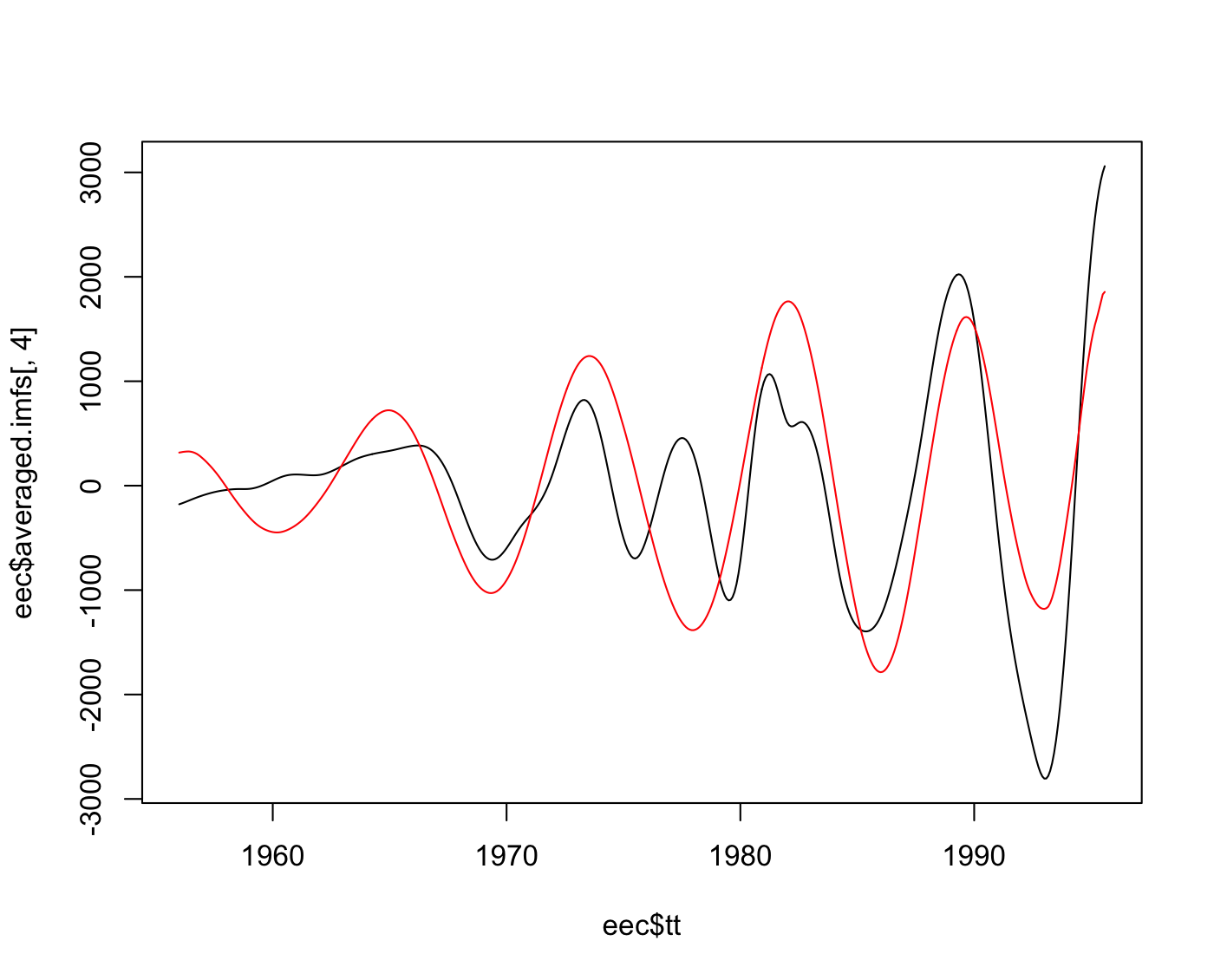
with the EEMD solution showing more variability from year to year, which might more realistic or it might simply be an artifact. We could compare other components, though there is not necessarily a one-to-one correspondence because I chose groupings in the SSA reconstruction. One last comparison is a roughly eight-year cycle that both methods found, where again the EEMD result is more irregular:
plot (eec$tt, eec$averaged.imfs[,4], type="l")
lines (gas.rec$M96, col="red")
SSA requires more user analysis to implement, and also seems as if it would benefit more from domain knowledge. If I knew better how to trade off the various diagnostic outputs and knew a bit more about the natural gas trade, I believe I could have obtained better results with SSA. As it stands, I applied both methods to a domain I do not know much about and EEMD seems to have defaulted better. Rssa is also handicapped in comparison to EEMD via hht because basic SSA has similar problems to basic EMD, though hopefully Rssa will implement extensions to the algorithm, such as those suggested in Golyandina & Shlemov, 2013, placing them on a more even footing.
Note from the R code for the graphs that SSA preserves the ts attributes of the original data, while EMD does not, which is one of several very convenient features.
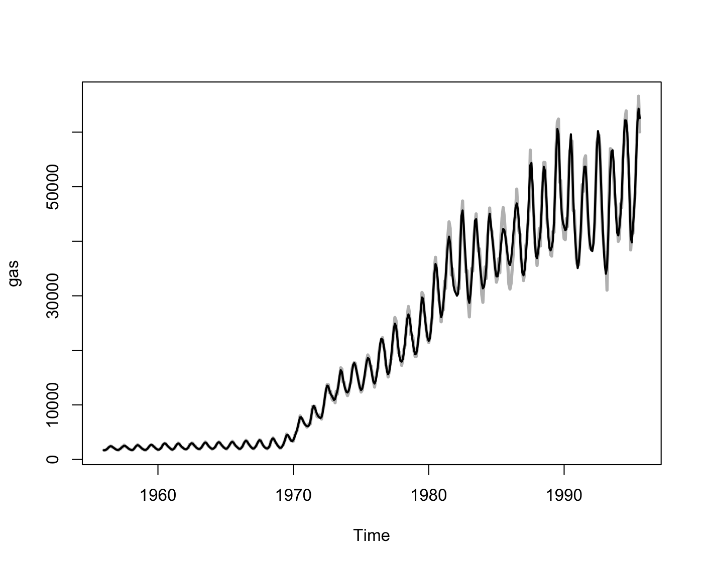
OK, since I love graphs, let’s do one last comparison of denoising, where we skip my pair choices. The EEMD solution uses 6 components plus the residual (trend), for a total of 7. The rough equivalent for SSA would then be 14 eigenvector pairs, so let’s just pick the first 14 eigenvectors and mix them all together and see what we get:
r <- reconstruct (gas.ssa, list (T=1:14))
plot (gas, lwd=3, col="gray")
lines (r$T, lwd=2)

Which matches well, except for the flat trend around 1965, and looks very smooth. The EEMD solution is (leaving out the first IMF to allow for a little smoothing):
plot (gas, lwd=3, col=”gray”)
lines (c(eec$tt), eec$averaged.residue + apply (eec$averaged.imfs[,2:6], 1, sum), lwd=2)
which is also reasonable, but it’s definitely not as smooth and has some different things happening around 1986. Is this more realistic or quirky? Unfortunately, I can’t tell you. Is this a fair comparison? I believe so, since EEMD was attempting to break the signal down into 7 components, plus noise, and SSA ordered the eigenvectors and I picked the first N. Is it informative? I’m not sure.
Twiddly knobs and dials
Let’s consider the dials and knobs that we get for each method. With SSA, we have the lag, L, the eigenvector groupings, and some choices of methods for things like how the SVD is calculated. With EEMD, we have the maximum number of IMFs we want, a choice of five different stopping rules for sifting, a choice of five different methods for handling curve fitting at the ends of the time series, four choices for curve fitting, the size of the ensemble, and the size of the noise.
So EEMD has many more up-front knobs, though the defaults are good and the only knobs we need to be very concerned with are the boundary handling and the size of the noise. The default boundary for emd is “periodic”, which is probably not a good choice for any non-stationary time series, but fortunately the default for EEMD is “wave”, which seems to be quite clever at time series endpoints. The noise needs to be sufficiently large to actually push the ensemble members around without being so large as to swamp the actual data.
On the other hand, SSA has a whole series of diagnostic graphs that need to be interpreted (sort of like Box-Jenkins for ARIMA on steroids) in order to figure out what eigenvectors should be grouped together. For example, a first graph is a scree plot of the singular values:
plot (gas.ssa)

From which we can see the trend at point 1 (and maybe 2), and the obvious 3:4 and 6:7 pairings. We can then look at the eigenvectors, the factor vectors, reconstructed time series for each projection, and phase plots for pairings. (Phase plots that have a regular shape — circle, triangle, square, etc — indicate that the pair is working like sin-cosine pairs with a frequency related to the number of sides. This is preferred.) Here’s an example of the reconstructions from the first 20 eigenvectors:
plot (gas.ssa, “series”, groups=1:20)

You can see clearly that 6:7 are of similar frequency and are phase-shifted, as are 18:19. You can also see that 11 has a mixing of modes where a higher frequency is riding on a lower carrier, and 12 has a higher frequency at the beginning and a lower frequency at the end. An extended algorithm could minimize these kinds of issues.
There are several other SSA diagnostic graphs I could make — the graph at the top of the article is a piece of a paired phase plot — but let’s leave it at that. Rssa also has functions for attempting to estimate the frequencies of components, for “clusterifying” raw components into groups, and so on. Note also that Rssa supports lattice graphics and preserves time series attributes (tsp info), which makes for a more pleasant experience.
Summary
I prefer the Rssa package. It has more and better graphics, it preserves time series attributes, and it just feels more extensive. It suffers, in comparison to EMD/hht because it does not (yet) implement extended methods (ala Golyandina & Shlemov, 2013), and because SSA requires more user insight.
Neither method appears to be “magical” in real-world applications. With sufficient domain knowledge, they could each be excellent exploratory tools since they are data-driven rather than having fixed bases. I hope that I’ve brought something new to your attention and that you find it useful!

Nice Article. I feel like shifting to R for data analysis work. Just a small correction: library (SSA) should be replaced by library (MSSA)
Hi Wayne,
Thanks for the interesting post on EMD! :)
Currently, I am working on financial time series data using EMD. I am not quite sure how to use “tt” described in hht package. I am working on weekly data for 8 years. But my period starts at September 17, 2007 and ends at July 2015. It would be nice if you give some insight on the same. Thanks a lot in advance!
The dataset `tt` is the $x$ values that go with the `sig` $y$ values. If you look at the `EEMD` function’s help, you’ll see that the first two arguments are the time series ($y$ values) and the sample times ($x$ values), so you have an example dataset. If you’re asking about the `tt` argument to `EEMD`, that’s the time measurements, and my first guess would be that this provides context for various diagnostics and plots. (That is, without a `tt` argument — if that is legal — you’d end up working in an abstract unit of time step rather than in the actual unit. Make sense?
Thank you! :) Yes, it makes perfect sense. I tried with tt = NULL, it seemed to work but I would like to check how to represent the weekly data in tt. I tried importing the dataset using read.ts but I am getting some problem with offset parameter. Will explore further on the same.
If you have a time series (
tsobject,myData),c(myData)will give you just the data (i.e.sig), andc(time (myData))will give you just the times (i.e.tt). Thecfunction simply concatenates values, but in this case I am taking advantage of the fact that it strips off attributes so we just get numeric vectors.Dear Wayne Folta
I generated a sinusoidal signal with frequency f1=100 Hz. Then found the EMD to get the first two IMF, which were displayed. But the instantaneous signal showed for the signal indicated 0.1 Hz using spectrogram.
My queries are :
1) The instantaneous frequencies must be 100 Hz through out, but even this 0.1Hz which is shown has some irregularities.
2) Is this instantaneous frequency of imf 1 . If so how can I get for other imf?
3) The amplitude spectrum seems like a color bar, which is difficult to identify from the figure. How can I make them more visible?
The code is as follows:
library(EMD)
library(hht)
# Signal with freq f1
tt <- seq(0, 1, by=.001)
f1 <- 100;
xt <- sin(2*pi*f1*tt)
### EMD
interm1 <- emd(xt, tt, boundary="wave", max.imf=2, plot.imf=FALSE)
par(mfrow=c(3, 1), mar=c(3,2,2,1))
plot(tt, xt, main="Signal", type="l")
rangeimf <- range(interm1$imf)
plot(tt, interm1$imf[,1], type="l", xlab="", ylab="", ylim=rangeimf, main="IMF 1")
plot(tt, interm1$imf[,2], type="l", xlab="", ylab="", ylim=rangeimf, main="IMF 2")
### Spectrogram : X – Time, Y – frequency,
### Z (Image) – Amplitude
test1 <- hilbertspec(interm1$imf)
spectrogram(test1$amplitude[,1], test1$instantfreq[,1])
I started learninig R and this technique is new to me. Can you kindly answer these questions.
Thanks in advance.
(I acknowledge and cite Kim, Donghoh, and Hee-Seok Oh. "EMD: A package for empirical mode decomposition and hilbert spectrum." The R Journal 1.1 (2009): 40-46.APA, from where I have taken the parts of R code and modified.)
Regards
Vishnu
I generated a sinusoidal signal with frequency f1=100 Hz. Then found the EMD to get the first two IMF, which were displayed. But the instantaneous signal showed for the signal indicated 0.1 using spectrogram.
My queries are :
1) The instantaneous frequencies must be 100 Hz through out, but even this 0.1 Hz which is shown has some irregularities. WHy is it so?
2) Is this instantaneous frequency of imf 1 . If so how can I get for other imf?
3) The amplitude spectrum seems like a color bar, which is difficult to identify from the figure. How can I make them more visible?
The code is as follows:
library(EMD)
library(hht)
# Signal with freq f1
tt <- seq(0, 1, by=.001)
f1 <- 100;
xt <- sin(2*pi*f1*tt)
### EMD
interm1 <- emd(xt, tt, boundary="wave", max.imf=2, plot.imf=FALSE)
par(mfrow=c(3, 1), mar=c(3,2,2,1))
plot(tt, xt, main="Signal", type="l")
rangeimf <- range(interm1$imf)
plot(tt, interm1$imf[,1], type="l", xlab="", ylab="", ylim=rangeimf, main="IMF 1")
plot(tt, interm1$imf[,2], type="l", xlab="", ylab="", ylim=rangeimf, main="IMF 2")
### Spectrogram : X – Time, Y – frequency,
### Z (Image) – Amplitude
test1 <- hilbertspec(interm1$imf)
spectrogram(test1$amplitude[,1], test1$instantfreq[,1])
I started learninig R and this technique is new to me. Can you kindly answer these questions.
Thanks in advance.
(I acknowledge and cite Kim, Donghoh, and Hee-Seok Oh. "EMD: A package for empirical mode decomposition and hilbert spectrum." The R Journal 1.1 (2009): 40-46.APA, from where I have taken the parts of R code and modified.)
Regards
Vishnu
Glad to hear you’ve found EMD interesting! The first thing I notice is that your sine wave isn’t very-well sampled. Try raising the frequency of your sampling:
tt <- seq(0, 1, by=.0001)and I think your results (though much slower for the hilbert step) may be more what you expected.
I personally haven’t used the
hilbertspecorspectrogrampart of the package much, but when I set myttthis way, the results looked reasonable to me. Nyquist and all of that, perhaps.Hi I checked with 0.001 and 0.0001(but now had to reduce the signal length to 0.3s due to some error in allocating memory, i am not sure about it!). It showed 0.01 frequency for 0.0001 and 0.1 frequency for a sampling of 0.001. That too the frequency is irregular!
I think for a 100 Hz signal a sampling of 0.001s is good! Any suggestions to get instantaneous frequency of a signal!
When I set my
ttto 0.0001 (100 samples per cycle), I get a fairly straight line at 0.01, which is 100 Hz. Not sure why you seem to be getting such messy results. Have you compared the results to R’sspectrumor other FFT-based methods, using the same data?Thanks, Wayne. We do have a lot of interesting SSA stuff in preparation (including, surely, the methods to improve the separability). Stay tuned!
I’d like to draw one’s attention to the following two preprints:
http://arxiv.org/abs/1206.6910
http://arxiv.org/abs/1309.5050
Anton: this is great news, and thanks for posting it here! I had the first paper, but not the second. (I use Papers 2 to manage my collection of 5700+ papers.) I also have several papers by your co-author Nina Golyandina which are also good.
Wayne,
The present release of Rssa includes all the stuff described in http://arxiv.org/abs/1308.4022 (version updated) and even more. Check the examples for ‘iossa’ and ‘fssa’.
Also there is yet another preprint about SSA with applications to irregular-shaped objects: http://arxiv.org/abs/1401.4980
Excellent article. Thanks for posting